Prism
Introduction
Prism is a luxury eyewear brand that designs frames at the intersection of architecture and optics. Each piece is engineered for precision and crafted for beauty — titanium frames with tolerances measured in fractions of a millimeter, proprietary lens coatings that filter light in ways conventional eyewear cannot, and hinge mechanisms inspired by architectural joinery. The product is exceptional. The brand identity was not.
The existing identity was forgettable. It sat in a crowded luxury eyewear market between fashion-forward competitors with bold visual personalities and heritage brands with decades of cultural equity, belonging to neither camp. Prism's unique positioning — engineering-driven luxury, where the quality is in the invisible details — was completely absent from their visual communication. A potential customer browsing their website or encountering their product in a retail environment had no reason to understand why Prism was different from any other premium eyewear brand.
We began by understanding their manufacturing process at a level of detail unusual for a branding engagement. We visited the production facility in Japan, watched frames being assembled by hand, and learned about the material science behind their titanium alloys and lens coatings. The way light refracts through their proprietary coatings, the geometric precision of their hinge mechanisms, the specific grade of titanium they source — these technical realities became the conceptual foundation for the visual identity.
The challenge was to communicate engineering excellence through visual design without being literal or technical. The audience — affluent consumers who appreciate craftsmanship but aren't engineers — needed to feel the precision rather than read about it. The brand had to make the invisible visible through aesthetics alone.
Process
Brand Strategy
We positioned Prism at the intersection of engineering and aesthetics — a space occupied by brands like Leica in optics, Bang & Olufsen in audio, and Porsche in automotive. These are brands where technical excellence is felt through the product experience rather than explained through marketing copy. The brand promise crystallized into a single phrase: precision you can feel, beauty you can wear.
This positioning required a visual language that communicated both sides of the equation simultaneously. Too clinical and the brand would feel like a technical instrument. Too fashion-forward and it would lose the engineering credibility that differentiates Prism from competitors. The tension between these poles — warmth and precision, beauty and engineering — became the creative territory we designed within.
We also identified a strategic opportunity in the retail environment. Luxury eyewear is typically displayed in glass cases under uniform lighting, making every brand look similar from a distance. Prism's brand needed to create visual distinction at the shelf level — a recognizable presence that draws the eye before the product is even handled.
Visual Identity
The logotype references optical precision — letterforms constructed on a strict geometric grid with hairline weights that echo the thin titanium frames Prism produces. The spacing is mathematically precise, calculated to create equal optical tension between each character. The brand mark is a prismatic refraction motif — a subtle geometric pattern that appears as a watermark, an emboss, or a foil stamp across all touchpoints, suggesting the behavior of light without depicting it literally.
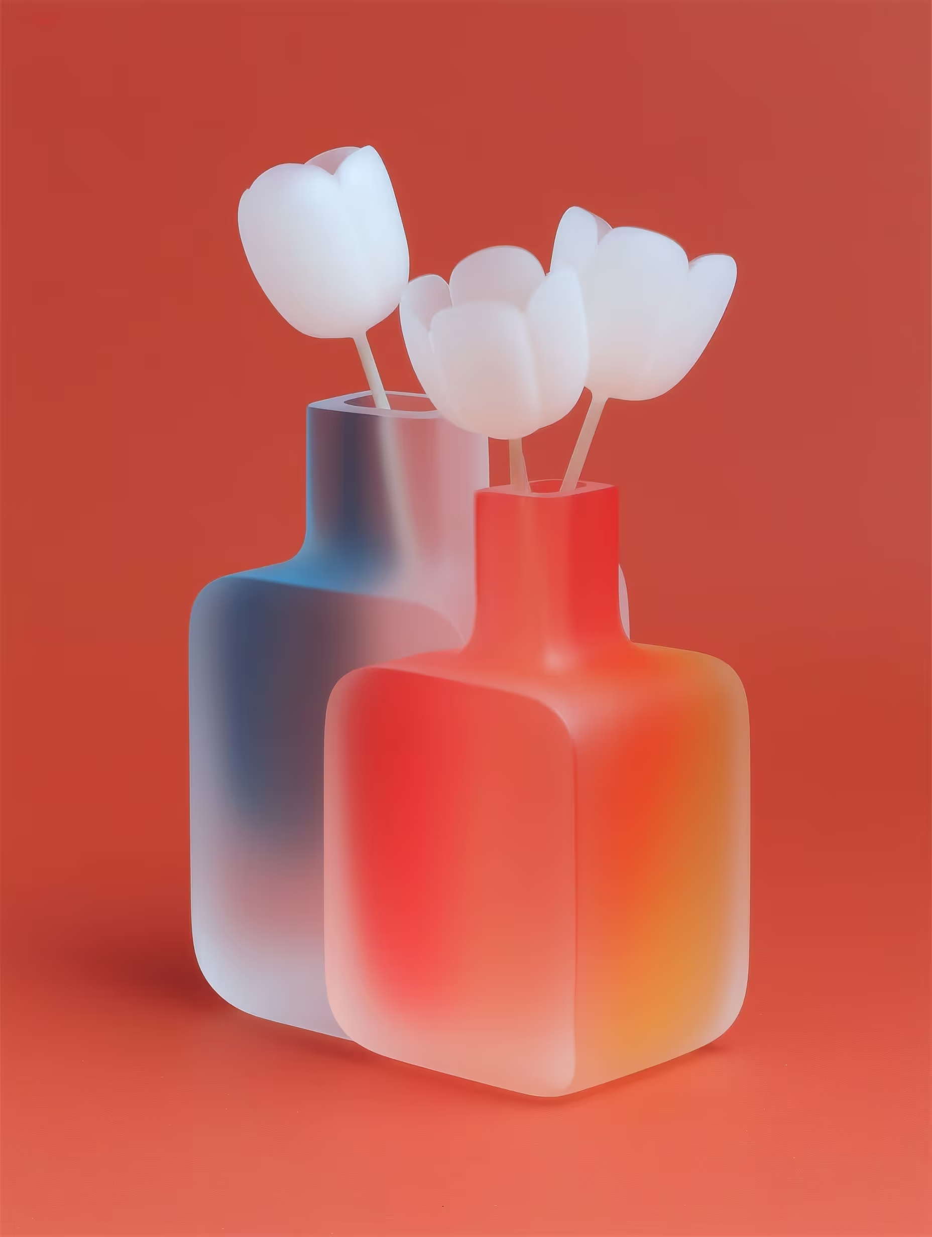
The color system is minimal and deliberate: matte black for authority and focus, optical white for clarity and space, and a single prismatic gradient used sparingly for moments of visual revelation. The gradient appears only where the brand wants to direct attention — the interior of packaging when it's first opened, the hover state on the website, the edge of a printed card. This restraint makes each appearance of the gradient feel special rather than decorative.
Typography is handled with surgical precision. A single geometric sans-serif family provides the full hierarchy, with weight as the only differentiator. The letterforms are optically corrected at every size, ensuring the same feeling of precision whether the type appears on a tiny temple engraving or a retail display.
Campaign Direction
The launch campaign featured close-up macro photography of the frames — revealing engineering details invisible to the naked eye. Hinge mechanisms photographed at 10x magnification. Surface textures of brushed titanium. The way light bends through a lens coating, captured in slow-motion video. Each image was shot against a single-color background that shifted across the prismatic spectrum, creating a campaign that felt both scientific and beautiful.
The campaign tagline — "See differently" — works on multiple levels: the optical technology, the design philosophy, and the brand's invitation to look closer at what others overlook. The macro photography literally enacts this proposition, revealing beauty in engineering details that most consumers never notice.

Conclusion
The rebrand repositioned Prism in the premium tier of the luxury eyewear market. Average sale price increased by 40% as the brand justified its premium through perceived quality and design authority rather than through discounting and promotions. The new identity gave retail partners confidence to stock Prism alongside established luxury brands, a placement the previous identity couldn't support.
The brand secured placement in 12 high-end optical retailers across North America and Europe within the first six months, and received unsolicited press coverage in design publications including Wallpaper, Dezeen, and It's Nice That. The coverage focused on the brand identity as much as the product itself — a testament to the visual system's strength as a story-telling vehicle.
The identity system proved its versatility across packaging, retail environments, digital channels, and event installations — always recognizable, never repetitive. The prismatic gradient, used sparingly across all applications, became an instantly recognizable brand signal that customers now associate with the quality and precision Prism represents.
"Gallery understood that our brand needed to communicate precision without saying the word. The identity is exactly that — engineered beauty."
— Architect Liu, Creative Director, Prism Optics